
- CHALLENGE & DURATION - Refine the existing Union Square Spinal Care website to better accommodate needs of users, in three days.
- OBJECTIVES
- Research the end-to-end experience to identify key friction points in the existing interfaces and build solutions to address user retention.
- Utilize their minimal aesthetic and color palettes to creative a more engaging user interface.
- ROLE - UX Researcher/Designer, Visual Designer
- DELIVERABLES - Research findings, persona, site map, wireframes, interface(low & high fidelity), clickable prototype

RESEARCH & FINDINGS

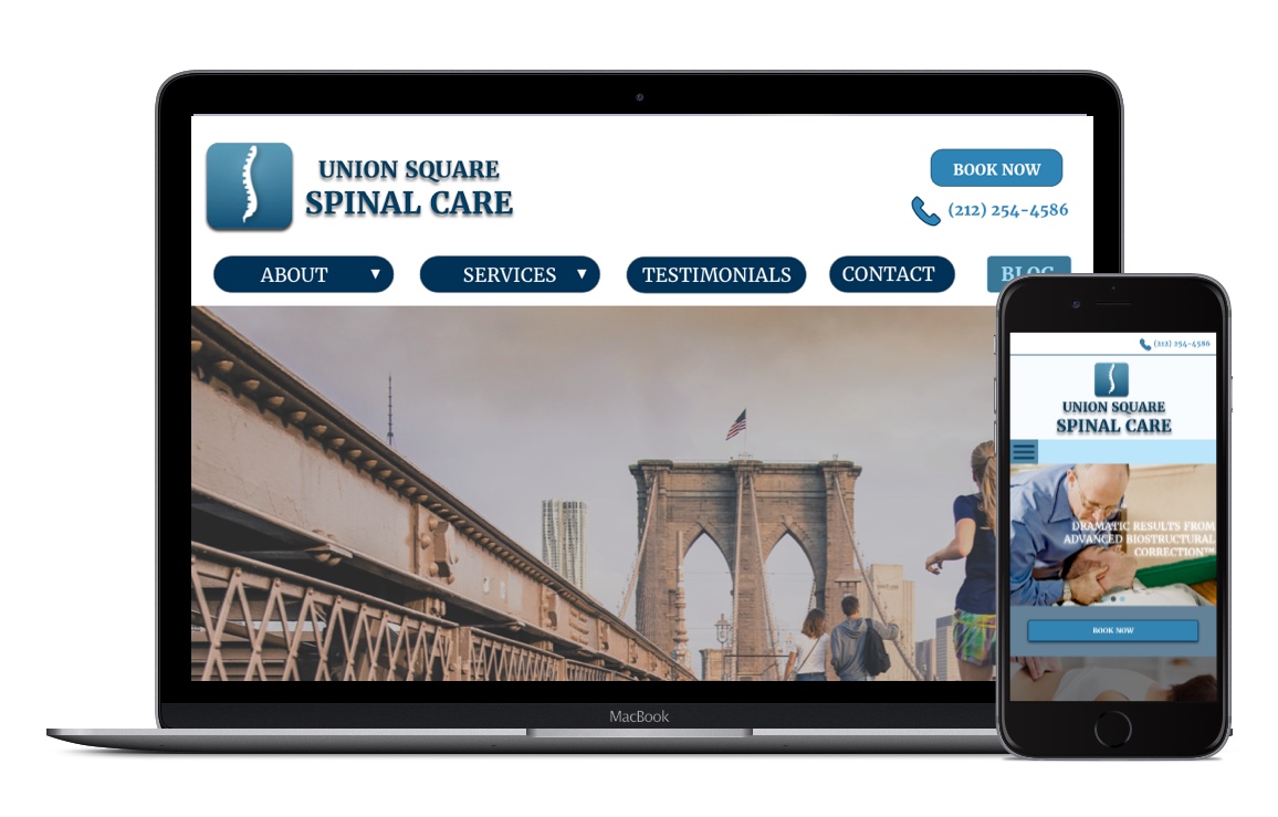
We conducted several usability tests with existing platform and interviewed participants to illustrate key problems with the existing interface, that can be seen here.
PERSONAS
We painted a picture of the kind of user that would visit the Union Square Spinal Care website, in an effort to clearly articulate a persona and guide our our design decisions.

DESIGNS
We focused our designs on the re-organization of existing information on current site, based on needs, wants, and friction points of users identified during our research for mobile and web.
We tested usability of multiple versions of site maps, prompting users to find certain information, in an effort to see the information architecture was intuitive to our user.
APP MAP REVAMP
We redesigned the existing information architecture on the current site before addressing other design problems.


USER INTERFACE REDESIGN
While adhering to the brands aesthetic, we gave the interface a little refresher.
WEB

Homepage redesign

Please click here to see the clickable prototype.
MOBILE(Responsive)
